Here you can find a collection of social media graphics that I have made for previous clients. Each section covers the various versions that I designed from start to finish along with a bit of insight as to my thought process.
If you’re interested in contacting me about designing any graphics for you or your company, contact me via the button below!
Social Media Graphics

Podcast Announcement Graphics
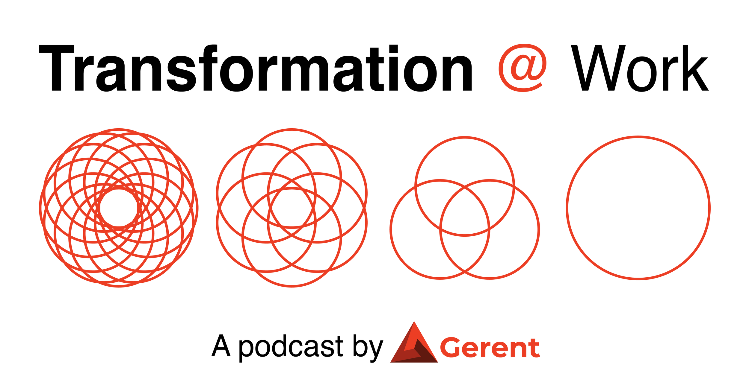
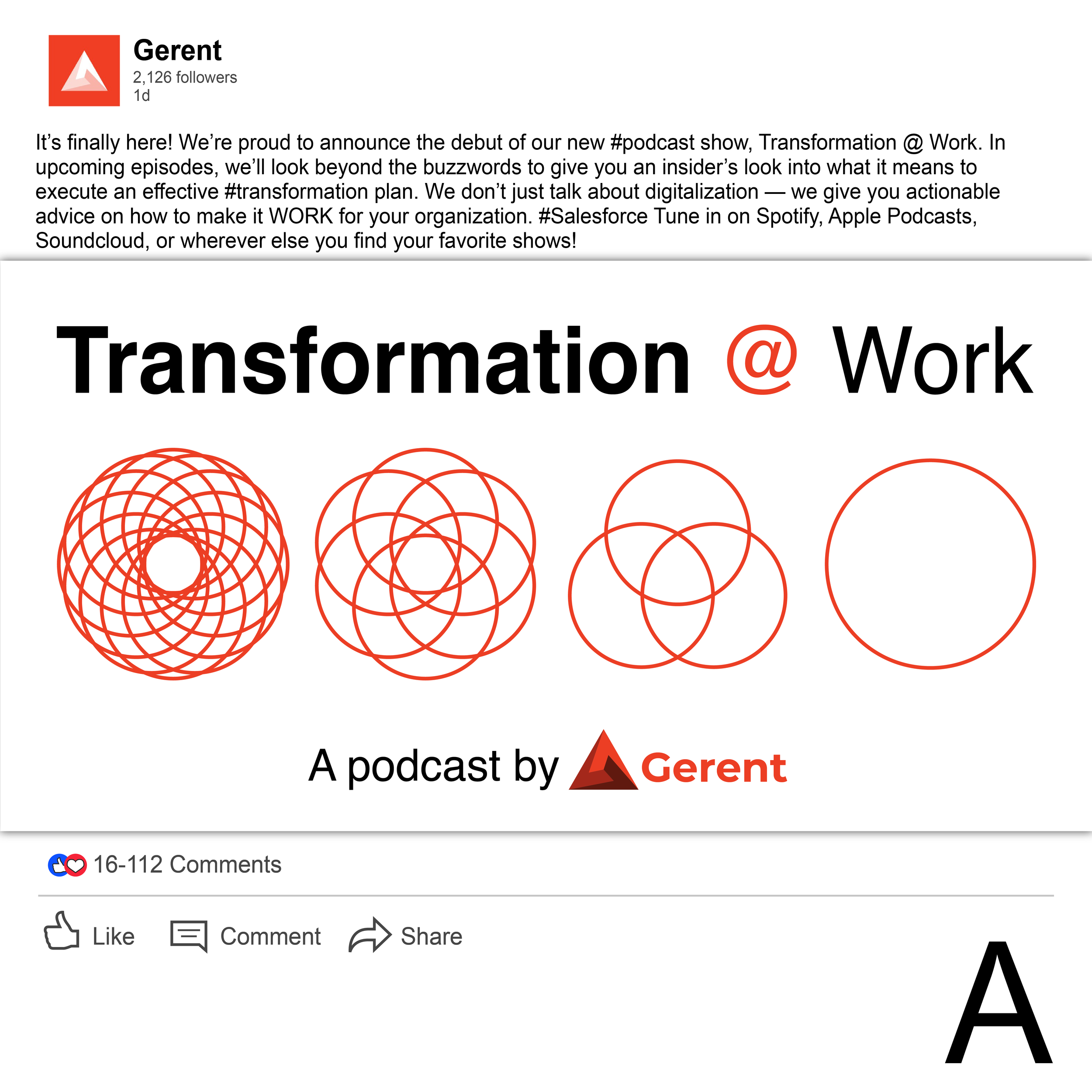
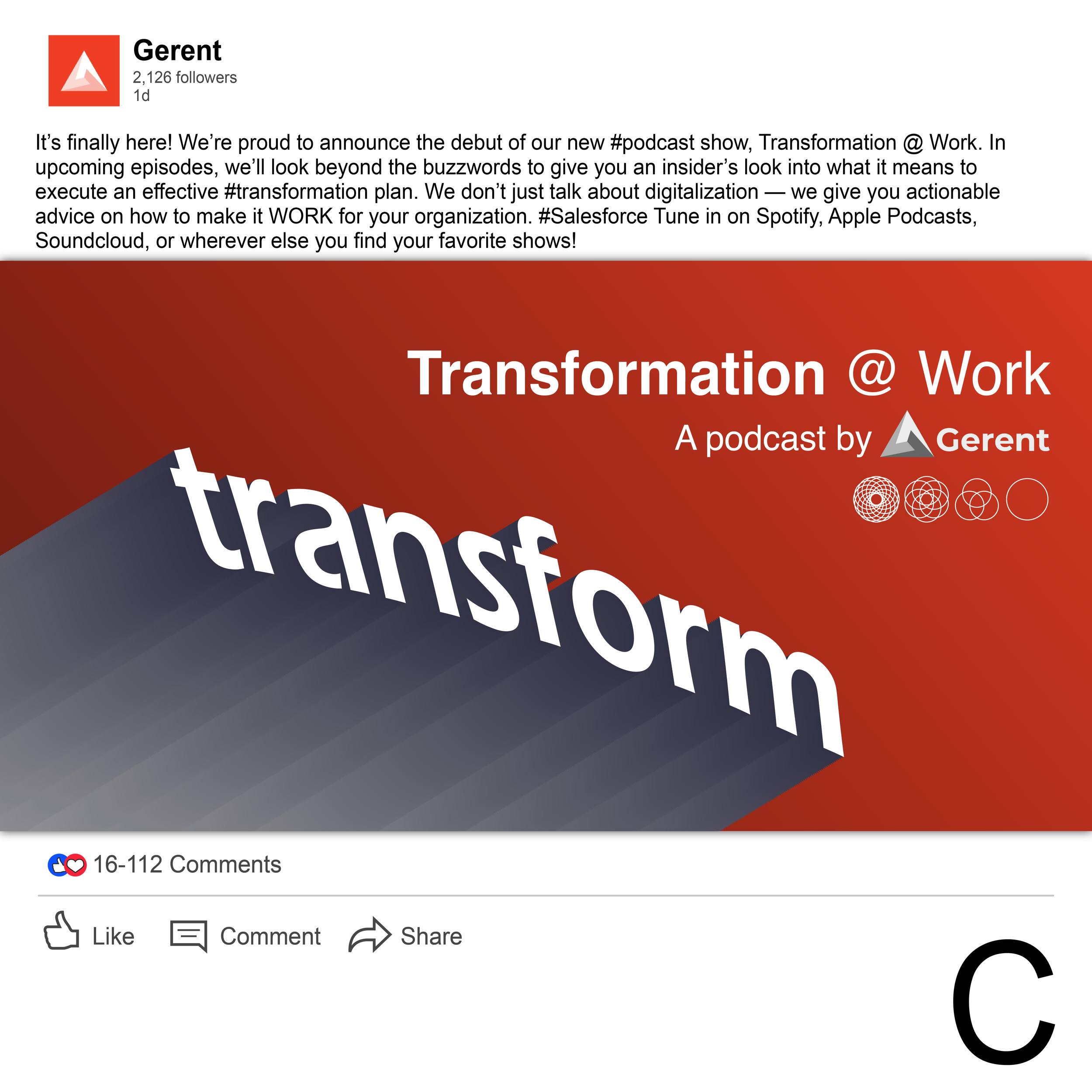
3 possible graphics made to announce a new podcast being released. The designs varied in style to give the client different options. The first design is more straightforward, featuring some geometric icons that would be used for this podcast’s logo. The white and scarlet color scheme is featured prominently throughout the company’s content and social media graphics.
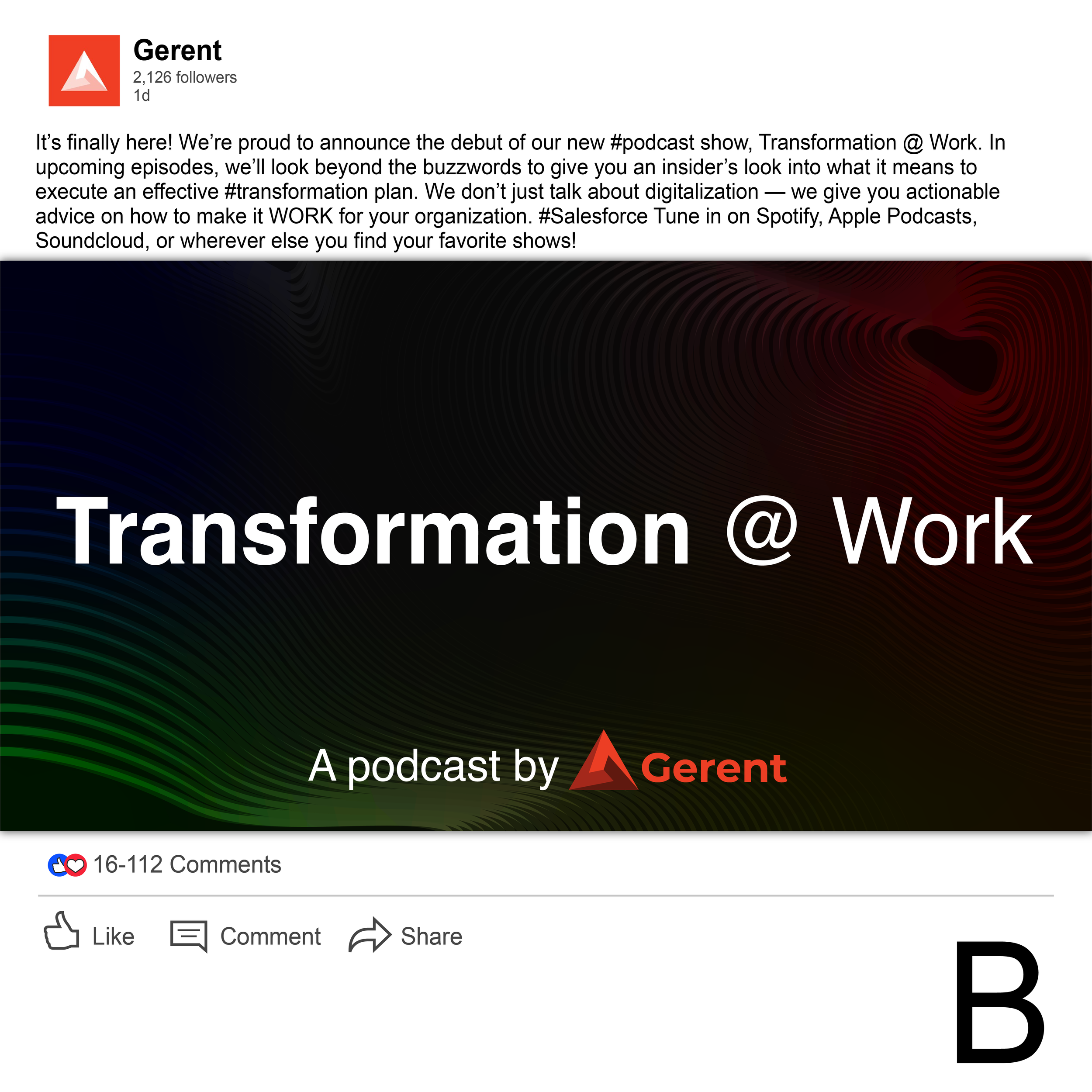
The second design sticks with the geometric lines and features a darker color scheme. Its overlapping patterns maintain the same iconography of the podcast logo, but is more subdued to make it feel introspective.
The third design branches out and features a more modern design. It prominently utilizes a vibrant color scheme, focusing on one idea. Its gradients allow the design to remain minimal yet attention grabbing.
Animated Podcast Announcement
The client also showed interest in a possible animated design. I mocked up a quick version that displayed the information. Its function is to catch the viewer’s attention as they scroll through their feed, making sure to depict the name and indicate that the post is about a podcast.
White Paper Graphics
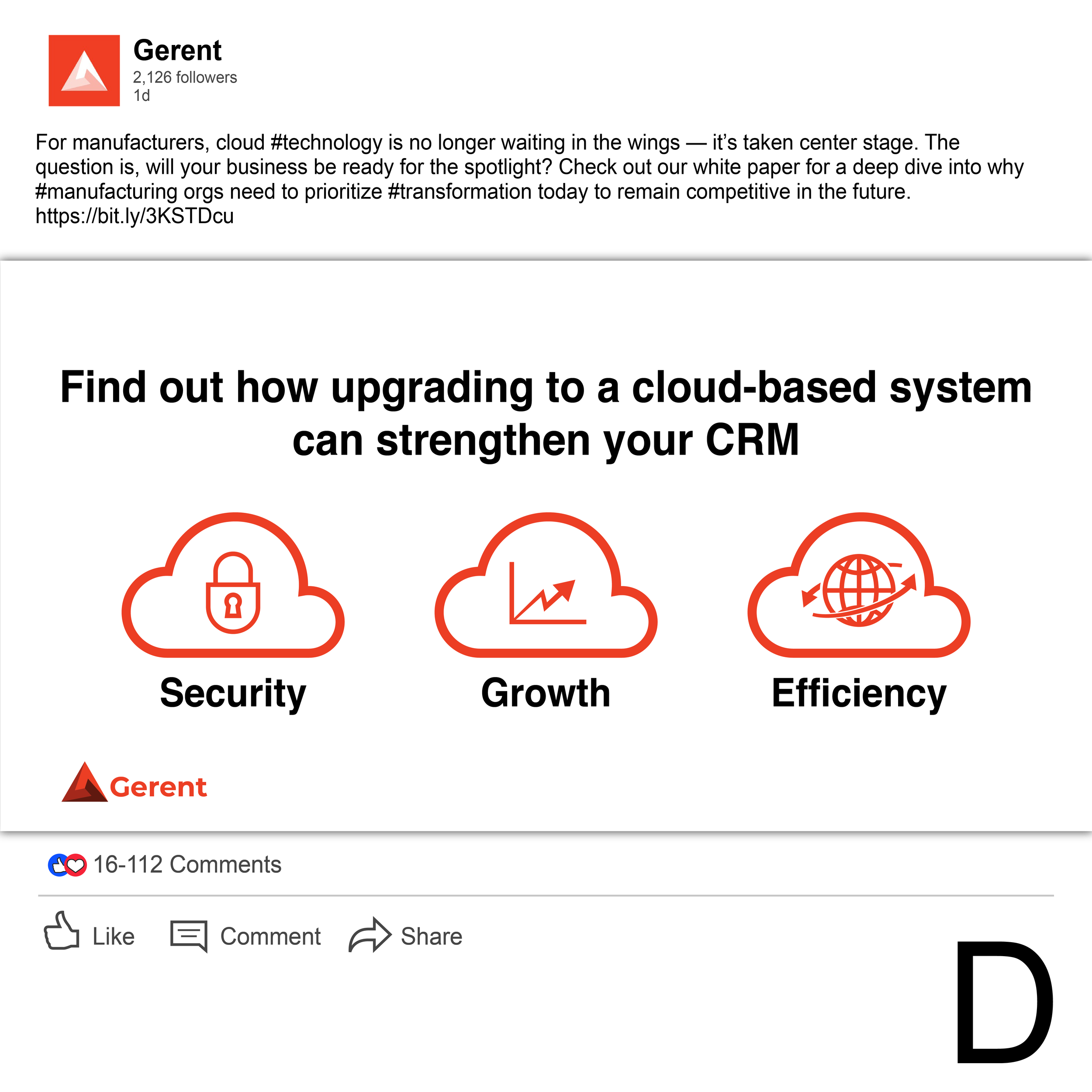
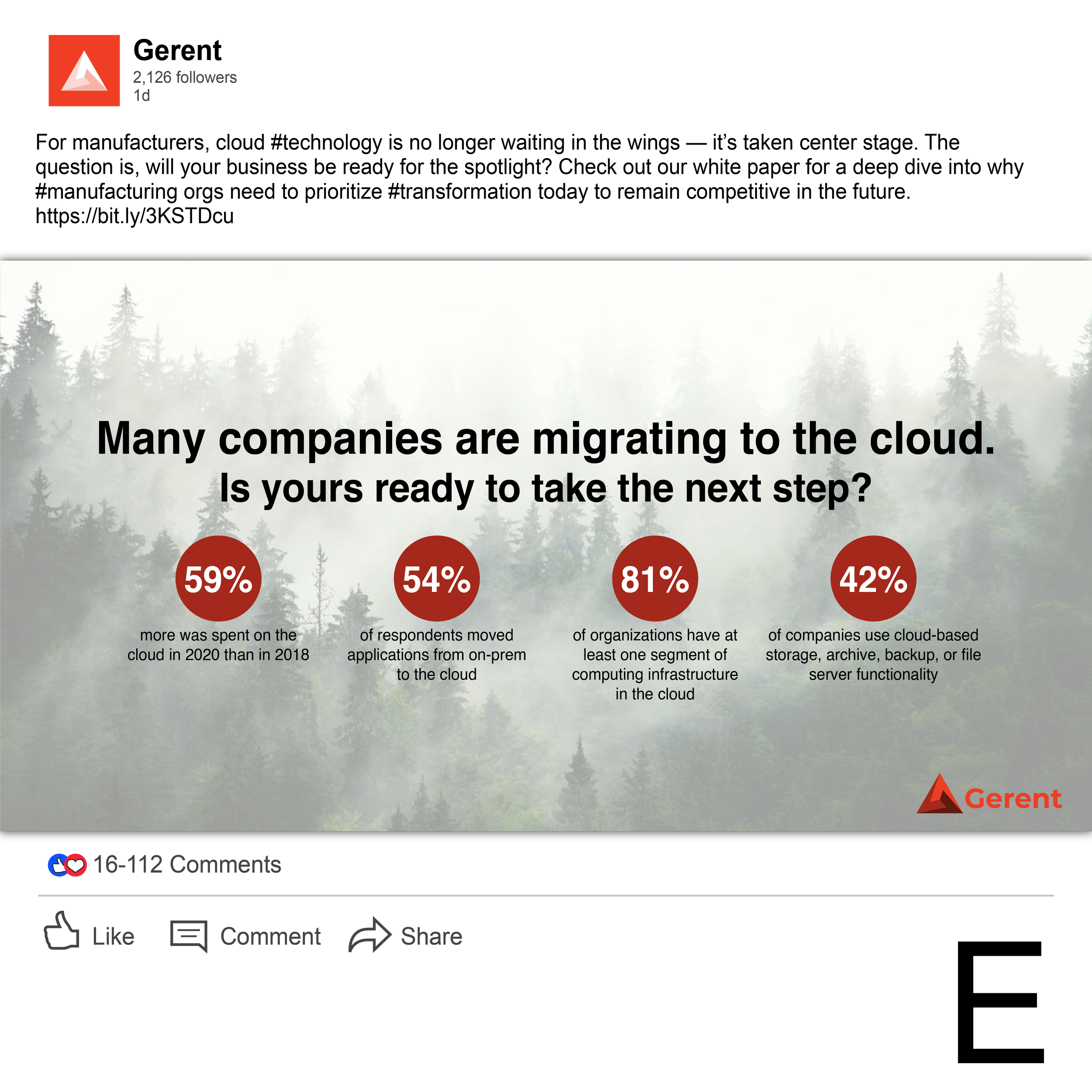
3 possible graphics made to announce the company’s next white paper being released. The designs varied in style to give the client different options. For these concepts, I read through their article and based the graphics off of their content.
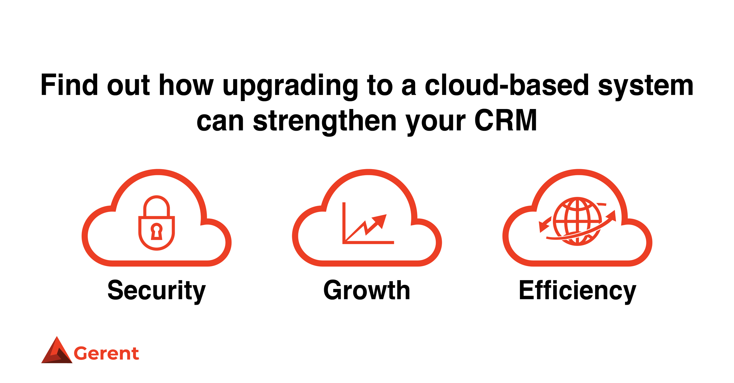
The first design is once again more straightforward, featuring some geometric icons that were used throughout the article. The white and scarlet color scheme is featured prominently throughout the company’s content and social media graphics.
The second design summarizes some information from the article in an infographic. It is displayed on top of a light natural photograph to make the ideas feel fresh and clean.
The third design goes in a more graphic design style. It again takes some of the information from the article and condenses it into an infographic, but this time remains minimal with a vibrant color scheme.

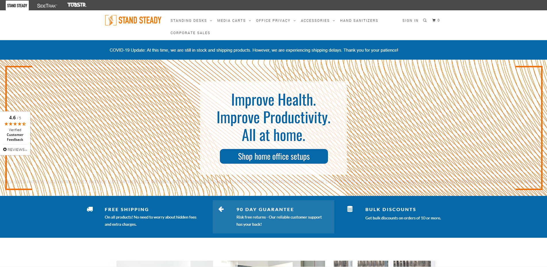
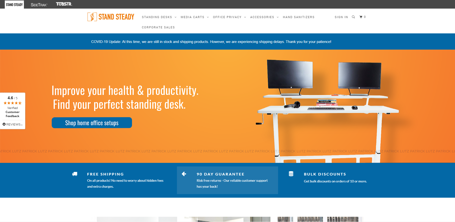
Stand Steady Website Banner
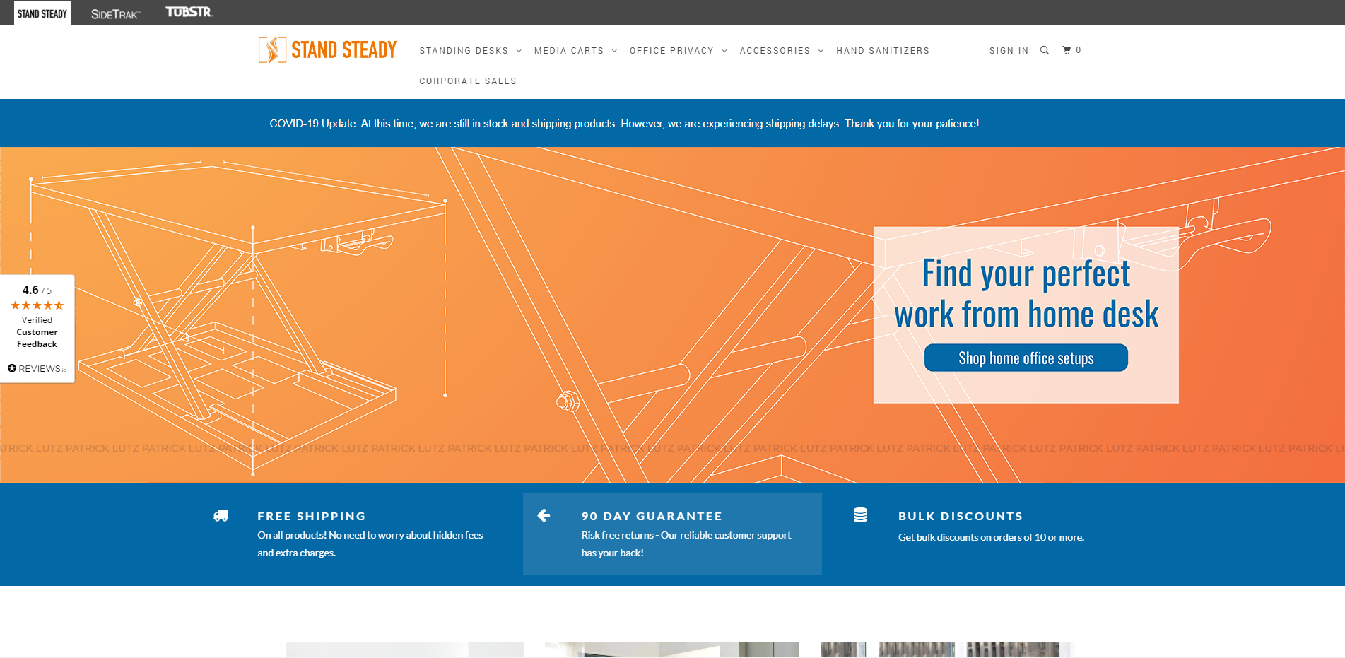
A mock up for a banner to be used on a standing desk company’s front page of their website. Features 3 different versions in slightly different styles to match the client’s needs.

