Blend & Brand
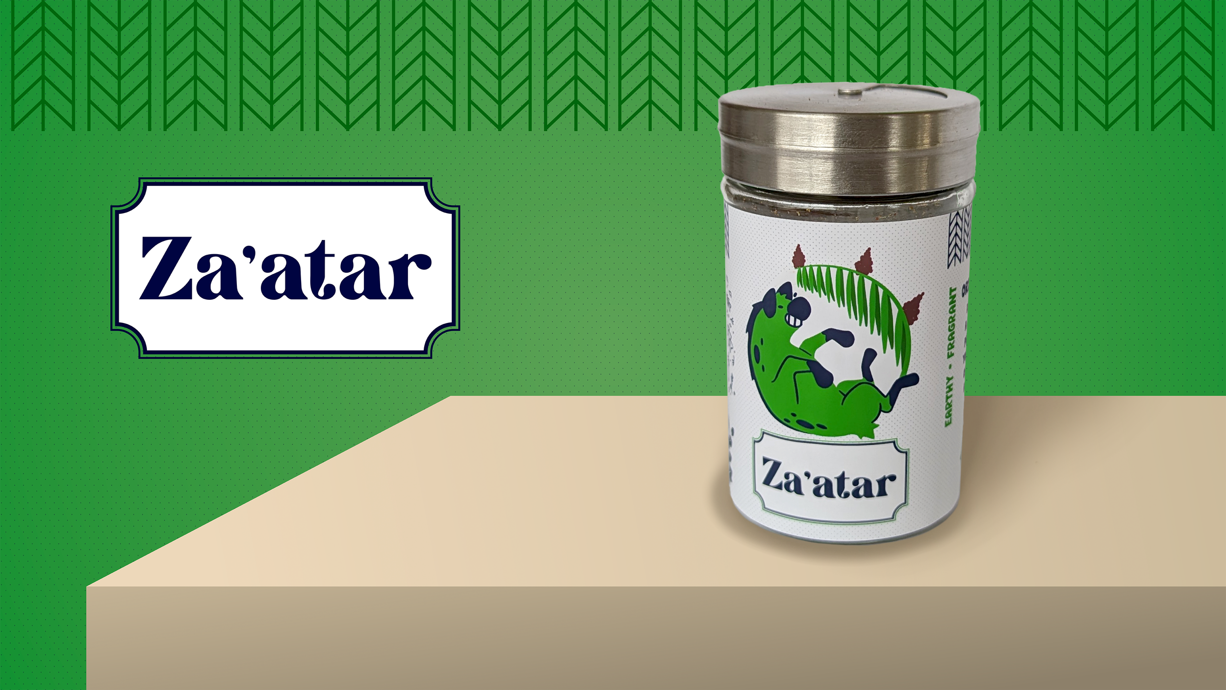
Blend & Brand is a collection of spice blends designed to showcase spice blends featuring flavors and stylings from countries around the world.
This series of three designs celebrates the flavors’ deep connections with the cultures from which they originate. Each illustration draws inspiration from the vibrant beauty of each country’s national colors and animals.
Year Created: 2024
Format: Digital Design, Print
Programs: Procreate, Illustrator, Photoshop
The Process:
I began with sketching initial concepts, exploring different layouts, typography, and iconography. I wanted the style to be bright, fresh, and fun while also keeping it down to earth with natural herbal symbols. In addition to a playful character interacting with some of the key ingredients, the label tells a story gives the consumer a snippet about the flavor profile and useful ways to utilize the blend.
For the fonts, I ended up going with Victorian Britania for the main label and HEYA Sans for all of the surrounding text. Victorian Britania is a legible font with thick enough letters to be able to be read at the printed size (6”x2.5”). I chose a serif font to keep the design grounded and feel more traditional, while also keeping to the modern theme. HEYA Sans is light, playful, and bold, matching the bubbly characters.


The Product:
The finished designs were printed in-house and adhered to glass spice jars. Each spice mix was cooked, blended, and assembled by hand, reinforcing the connection between branding and the product’s artisanal quality. This project allowed me to develop key packaging design skills, including label layout, typography selection, color theory, and brand storytelling. I also gained hands-on experience with print production, dieline creation, and material selection, ensuring that the labels were both visually appealing and functional for retail display. By balancing aesthetic appeal with clear communication, I created packaging that enhances consumer engagement and shelf presence, key considerations for branding, product marketing, and food packaging design.
Each jar was also included with a recipe card to enhance the user’s experience and give them a place to start off. Some people may be excited but lost when receiving an unfamiliar spice, so this helped to overcome that first step. The cards include delicious photos of the meals and clear instructions.
Older Work
Planet Express Mock-up
A visualization of a product line-up for the fictional company from the animated show Futurama. A slightly retro-futuristic style. Focuses on the iconic space ship in all the designs to feel like every product is on the move.
Imperial Mock-up
A visualization of a product line-up for the Empire from the Star Wars franchise. Focuses on using the dashes found on the interior of their space ships and an ominous color pallette.


